MFA Thesis Exhibition
April 11 - 15 2011
Reception: Monday, April 11th, 4 - 6 pm
Herter Gallery
University of Massachusetts
Amherst, MA
gallery hours: M-F 11-4, Su 1-4

Wednesday, March 30, 2011
MFA Thesis Show Invitational videos
Monday, March 28, 2011
Soft Spot

Announcing the launch of Soft Spot, a new online alternative arts space and gallery project that I, Ryan Feeney, have started with Kim Hennessy.
The site is intended to be a social and communal project so we would love and appreciate any submissions, proposals, comments or ideas. Contact us at kim@soft-spot.net and ryan@soft-spot.net "
Wednesday, March 23, 2011
Wednesday, March 16, 2011


Sunday, March 06, 2011
Ken Taylor: Cento made of Charlie Sheen quotes
We Work for the Pope by Ken Taylor published at http://mipoesias.com/
 J. Phoenix, C. Sheen. I'm just sayin
Friday, March 04, 2011
Mark Bradford: ICA
a review of Bradford’s current exhibition at Boston’s ICA
Nov 19, 2010, - March 13, 2011

“I saw the best minds of my generation destroyed by madness… who were burned alive in their innocent flannel suits on Madison Avenue amid the blasts of leaden verse & the tanked-up clatter of the iron regiments of fashion & the nitroglycerine shrieks of the fairies of advertising & the mustard gas of sinister intelligent editors, or were run down by the drunken taxicabs of Absolute Reality.”
Allen Ginsberg, Howl
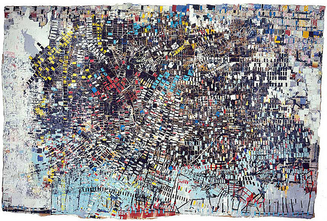
I open this review of Mark Bradford’s current exhibition with an overused quote from Ginsberg’s Howl. Though I felt it appropriate, as I thought of the poem several times while walking through the show. Bradford creates scenes that are at once a bird’s eye view of urban American landscapes and a focus on the consequences and questions had, for those who live in such places. In a sense, Bradford, like Ginsberg (though to a far less degree), lifts the curtain on contemporary urban American life.
 Kryptonite
 Scorched Earth
Bradford’s paintings imply all the flourishes of abstract expressionism in its various guises, with the punctuating technique of collage and decollage, varying hints at aerial views of urban landscapes and topographical maps, and the apparent labor-intensive construction, each distinguished by a politically loaded title. Upon a first encounter, they are, plainly put, lovely to look at. When moving past the works seductiveness, and further into investigation, it is the materials that take the foreground in grasping a better understanding.
Bradford transforms two-dimensional items collected from the streets, attempting to lend another view of subway posters and ragged billboards. Advertising stripped away from itself and appropriated in the form of abstract painting is nothing new. And though Bradford’s paintings offer little in the ways of innovation, they do impart a sense of dedication to the origins of the artist, and the materials of the place he came from.
 Los Moscos
One thing I might discern is the seemingly random use of the found materials. Most of his paintings use bits of torn paper appropriated from the streets (earlier works using papers once used to curl hair, as Bradford was a stylist), some are left more intact than others, as in Thriller (2009), for example, which very plainly shows Nirvana’s Nevermind poster as part of its composition. I suppose when considering this band poster, among the others, within the context of the painting, named, I assume, for Michael Jackson’s pop hit of the 80’s (Bradford includes many music references in his work), the appropriation makes a thin sort-of sense. What becomes most interesting about this painting (and what I might say about the lot of them), is the massively textured, labored over surface. Using hardware tools like power sanders, Bradford digs crevices into the surfaces of his work. These textured spaces, as in Thriller, wind and swirl their ways around and through the haphazard array of materials pasted to the surface like the curving paths worms leave in the dirt after a heavy rain or exploding across the façade of an old dead tree.
Many works are far scrappier, in that the choices made with the material frequently have to do with what bits of color might show through. As in Potable Water, (2005) where we have the pleasure of texture through the pasting and stripping away of materials, though apparently on a purely formal level. Slices of blue cut across the large paper owing to a fairly obvious symbol of water, then sprinkled at the top with squares of neon orange, pink and green. The colors do hint at recent trends in advertising. One easily thinks of those simple, cheaply made neon posters pasted up on permanent plywood walls at the bases of scaffolding, or lining abandoned lots in the mostly poor neighborhoods of any major American city. The gesture hints at the street art of Margaret Kilgallen, Swoon, Steven Powers, and even Basquiat to name only a few. As these artists, like Bradford, took the manipulation of similar materials (found wall scraps in run-down neighborhoods) from the site-specific space of the street, into the site-specific space of the gallery. Bradford’s gestures toward art history don’t stop there, but touch on notes of Rauschenberg’s combines (most notably in Bradford’s piece Crow, which is a taxidermy crow with wings spread, beak to the wall), Peter Halley’s contained hyper-realized urban geometries, Agnes Martin’s pale grids, Julie Mehretu’s densely layered paintings, and even Piet Mondrian’s early inkling’s toward abstraction.
 Potable Water
 Piet Mondrian: Tableau No. 2/Composition No. VII, 1913
 Peter Halley
 Agnes Martin
 Julie Mehretu: Stadia II,
 Piet Mondrian: Composition V
 Robert Rauschenberg: Canyon
Another piece which employs all the previously stated elements but which stood out as a better handled painting was Strawberry (2002), named for the slang term for a female crack addicted prostitute. This piece is again riddled with what look like rectangular coffee cup stains raining down over scraps of hot pink and orange. The odd arrangement of rectangles look like a child’s sincere attempt at drawing a grid, the effect though is one of urban topography balanced with a foundation’s figure drawing exercise using cubes to find proportion, and the simple pleasure of a deliciously slick surface. The combination of these elements: a grid of collaged scraps, hints at urban topography, bits of flashy colored paper, are apparent in nearly every piece, which leaves the question, is Bradford working with a limited vocabulary?

Bradford aims at pointing to issues of race, sexuality, identity and class, issues that need consistent attention, and, as far as the art world is concerned, receive it. Aside from the more obvious (and frankly uninspired) pieces such as Untitled (Shoe, 2003), and Kobe I got Your Back, (2008), a basketball covered in black billboard paper, both hinting at questions of masculinity in the black community, Bradford speaks a more discernable language with his video Niagra (though the room at the ICA is far too lit for video, making it washed out and faded). In it, a black man in mustard yellow shorts and a white tank top, strides away from the viewer in slow motion. The man, Melvin, walks past Bradford’s studio every day. The stride, is more of a swaying saunter, a confident exaggerated lilt, which is even further exaggerated by the slow motion and the gritty urban surroundings (cracked weedy cement, a discarded Wendy’s cup rolling in the wind). The video is based off of a 1953 Marilyn Monroe film in which she murders her husband and walks confidently away. Bradford’s appropriation of this film is utterly transformed in Niagra, pulling almost entirely away from its original. Bradford’s video breaths life into the idea of “what is black masculinity,” in a way Shoe simply fails to, with a simple but powerful gesture.
 (Untitled) Shoe
 Niagara
 Niagara, Marilyn Monroe
The more engaging works by Bradford in the ICA exhibition offer open-ended questions, works such as Niagra, or the more complex of the two dimensional works like Black Venus, which is a billboard size painting that balances multiple languages, from abstraction, to map, to billboard, to the social reality of its inspiration. Overall I had the feeling that the repetition in both idea and medium might be a bit safe to justify the attention Bradford is receiving for his work. I think with time Bradford can develop these ideas and skills into a more challenging investigation of the issues (both political and aesthetic) he is concerned with. That said, I do think the show is worth seeing. Bradford’s language is accessible and at times compelling, offering an occasionally unique glance into the urban American landscape.
 Black Venus
Nov 19, 2010, - March 13, 2011

“I saw the best minds of my generation destroyed by madness… who were burned alive in their innocent flannel suits on Madison Avenue amid the blasts of leaden verse & the tanked-up clatter of the iron regiments of fashion & the nitroglycerine shrieks of the fairies of advertising & the mustard gas of sinister intelligent editors, or were run down by the drunken taxicabs of Absolute Reality.”
Allen Ginsberg, Howl
I open this review of Mark Bradford’s current exhibition with an overused quote from Ginsberg’s Howl. Though I felt it appropriate, as I thought of the poem several times while walking through the show. Bradford creates scenes that are at once a bird’s eye view of urban American landscapes and a focus on the consequences and questions had, for those who live in such places. In a sense, Bradford, like Ginsberg (though to a far less degree), lifts the curtain on contemporary urban American life.


Bradford’s paintings imply all the flourishes of abstract expressionism in its various guises, with the punctuating technique of collage and decollage, varying hints at aerial views of urban landscapes and topographical maps, and the apparent labor-intensive construction, each distinguished by a politically loaded title. Upon a first encounter, they are, plainly put, lovely to look at. When moving past the works seductiveness, and further into investigation, it is the materials that take the foreground in grasping a better understanding.
Bradford transforms two-dimensional items collected from the streets, attempting to lend another view of subway posters and ragged billboards. Advertising stripped away from itself and appropriated in the form of abstract painting is nothing new. And though Bradford’s paintings offer little in the ways of innovation, they do impart a sense of dedication to the origins of the artist, and the materials of the place he came from.
 Los Moscos
One thing I might discern is the seemingly random use of the found materials. Most of his paintings use bits of torn paper appropriated from the streets (earlier works using papers once used to curl hair, as Bradford was a stylist), some are left more intact than others, as in Thriller (2009), for example, which very plainly shows Nirvana’s Nevermind poster as part of its composition. I suppose when considering this band poster, among the others, within the context of the painting, named, I assume, for Michael Jackson’s pop hit of the 80’s (Bradford includes many music references in his work), the appropriation makes a thin sort-of sense. What becomes most interesting about this painting (and what I might say about the lot of them), is the massively textured, labored over surface. Using hardware tools like power sanders, Bradford digs crevices into the surfaces of his work. These textured spaces, as in Thriller, wind and swirl their ways around and through the haphazard array of materials pasted to the surface like the curving paths worms leave in the dirt after a heavy rain or exploding across the façade of an old dead tree.
Many works are far scrappier, in that the choices made with the material frequently have to do with what bits of color might show through. As in Potable Water, (2005) where we have the pleasure of texture through the pasting and stripping away of materials, though apparently on a purely formal level. Slices of blue cut across the large paper owing to a fairly obvious symbol of water, then sprinkled at the top with squares of neon orange, pink and green. The colors do hint at recent trends in advertising. One easily thinks of those simple, cheaply made neon posters pasted up on permanent plywood walls at the bases of scaffolding, or lining abandoned lots in the mostly poor neighborhoods of any major American city. The gesture hints at the street art of Margaret Kilgallen, Swoon, Steven Powers, and even Basquiat to name only a few. As these artists, like Bradford, took the manipulation of similar materials (found wall scraps in run-down neighborhoods) from the site-specific space of the street, into the site-specific space of the gallery. Bradford’s gestures toward art history don’t stop there, but touch on notes of Rauschenberg’s combines (most notably in Bradford’s piece Crow, which is a taxidermy crow with wings spread, beak to the wall), Peter Halley’s contained hyper-realized urban geometries, Agnes Martin’s pale grids, Julie Mehretu’s densely layered paintings, and even Piet Mondrian’s early inkling’s toward abstraction.


Another piece which employs all the previously stated elements but which stood out as a better handled painting was Strawberry (2002), named for the slang term for a female crack addicted prostitute. This piece is again riddled with what look like rectangular coffee cup stains raining down over scraps of hot pink and orange. The odd arrangement of rectangles look like a child’s sincere attempt at drawing a grid, the effect though is one of urban topography balanced with a foundation’s figure drawing exercise using cubes to find proportion, and the simple pleasure of a deliciously slick surface. The combination of these elements: a grid of collaged scraps, hints at urban topography, bits of flashy colored paper, are apparent in nearly every piece, which leaves the question, is Bradford working with a limited vocabulary?

Strawberry
Bradford aims at pointing to issues of race, sexuality, identity and class, issues that need consistent attention, and, as far as the art world is concerned, receive it. Aside from the more obvious (and frankly uninspired) pieces such as Untitled (Shoe, 2003), and Kobe I got Your Back, (2008), a basketball covered in black billboard paper, both hinting at questions of masculinity in the black community, Bradford speaks a more discernable language with his video Niagra (though the room at the ICA is far too lit for video, making it washed out and faded). In it, a black man in mustard yellow shorts and a white tank top, strides away from the viewer in slow motion. The man, Melvin, walks past Bradford’s studio every day. The stride, is more of a swaying saunter, a confident exaggerated lilt, which is even further exaggerated by the slow motion and the gritty urban surroundings (cracked weedy cement, a discarded Wendy’s cup rolling in the wind). The video is based off of a 1953 Marilyn Monroe film in which she murders her husband and walks confidently away. Bradford’s appropriation of this film is utterly transformed in Niagra, pulling almost entirely away from its original. Bradford’s video breaths life into the idea of “what is black masculinity,” in a way Shoe simply fails to, with a simple but powerful gesture.


The more engaging works by Bradford in the ICA exhibition offer open-ended questions, works such as Niagra, or the more complex of the two dimensional works like Black Venus, which is a billboard size painting that balances multiple languages, from abstraction, to map, to billboard, to the social reality of its inspiration. Overall I had the feeling that the repetition in both idea and medium might be a bit safe to justify the attention Bradford is receiving for his work. I think with time Bradford can develop these ideas and skills into a more challenging investigation of the issues (both political and aesthetic) he is concerned with. That said, I do think the show is worth seeing. Bradford’s language is accessible and at times compelling, offering an occasionally unique glance into the urban American landscape.

Subscribe to:
Posts (Atom)